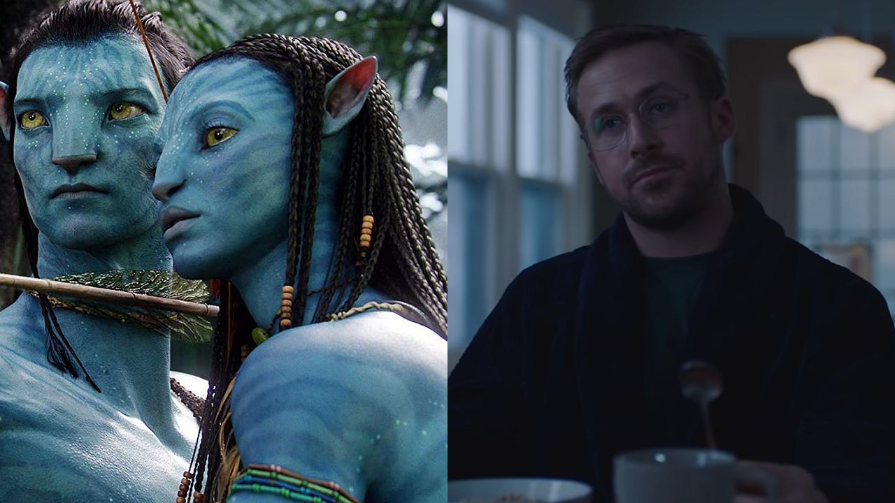
In the over 10 years since the first Avatar movie a lot of people have questioned whether the film, despite being the highest grossing movie of all-time worldwide, was really the cultural touchstone it appeared to be at the time. While the level of success seen by Avatar: The Way of Water will likely be the thing that truly helps answer that question, it’s hard to argue that there isn’t at least one element of the first Avatar that has remained relevant. Its papyrus title font.
Papyrus, much like comic sans, is a much maligned font, and so its use in the title of the original Avatar became a joke so popular that it eventually worked its way into a Saturday Night Live sketch with Ryan Gosling. James Cameron was recently asked by the BBC about his thoughts on the sketch, and he had the perfect response, showing that Cameron appreciated the joke, and that he knows the sketch, as he quoted it. Cameron said…
It’s haunted me….not really.
“It haunts me” is what Ryan Gosling says in the voice over of the popular SNL sketch about a man who is struggling to come to terms with the fact that the Avatar movie used the papyrus font. The sketch presents itself as a dark and depressing experience. There’s something clearly troubling this man, but the sketch makes you wait a bit before you realize the thing that what has him so torn up is a font.
James Cameron clearly can take a joke. He said he does think the sketch is funny, though he’s surprised that SNL put so much in terms of time and resources toward such a paper thin joke. It’s a full three minutes of watching a man go insane over a font. It is sort of impressive. For the record, the actual creator of the Avatar font also thinks the sketch is great. Check out Cameron’s full response in the video below.
.@JimCameron on being haunted by ryan gosling’s snl papyrus sketch ????????watch @AliPlumb’s interview in full on @BBCiPlayer ???? pic.twitter.com/jFTvlSUwIaDecember 20, 2022
Technically speaking, the Avatar title font isn’t traditional papyrus, but it does seem clear that the font that was used was based on it, and some changes were made from there. The title font has shifted to something new and more original in places like the Disney+ menu and anywhere else the title is being used, so even Disney has decided to move on from the original logo. Whether this was in direct response to the jokes or not we’ll likely never know.
Fonts are one of those things that some people seem to care about very deeply, while others often don’t notice. If SNL and Ryan Gosling had never laughed about it, it’s unlikely the issue ever would have become as prominent as it has.
Stay connected with us on social media platform for instant update click here to join our Twitter, & Facebook
We are now on Telegram. Click here to join our channel (@TechiUpdate) and stay updated with the latest Technology headlines.
For all the latest Hollywood News Click Here
