For over a decade, designers have been trying to use fonts to help dyslexics read more easily. Dyslexia is a learning disorder characterised by difficulty reading, writing and spelling, due to problems identifying speech sounds and a co-occurring visual perceptual dysfunction that makes it harder to relate sounds to letters and words.
In 2008, Dutch graphic designer Christian Boer, dyslexic himself, created the typeface Dyslexie. It helps dyslexics distinguish between letters by altering their design in small but significant ways. Boer’s letters are essentially asymmetrical and not all the same size. The stem of the “d” is narrower than that of the “b”, for instance, making them easier to tell apart. Letters that look alike, such as “v”, “w” and “y”, are made to vary in height.
In 2011, American app designer Abelardo Gonzalez designed the OpenDyslexic font, which has had over 757,000 downloads so far. Here too, similar-looking letters are redesigned in ways that make them more distinct from each other; some are slanted, some enlarged.
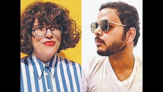
In October 2021, an Indian designer added his name to this list. Gurugram-based Pranav Bhardwaj, 36, has created Dyslexic Font, in collaboration with Swiss artist Rocio Egio, 31. It’s meant to help dyslexics and help people understand what it’s like to be dyslexic, he says.
Ever since Egio was diagnosed with dyslexia at 21, she has been creating art that represents how she sees the world of words. In September, she posted her interpretation of the English alphabet, on Instagram (@rocioegio).

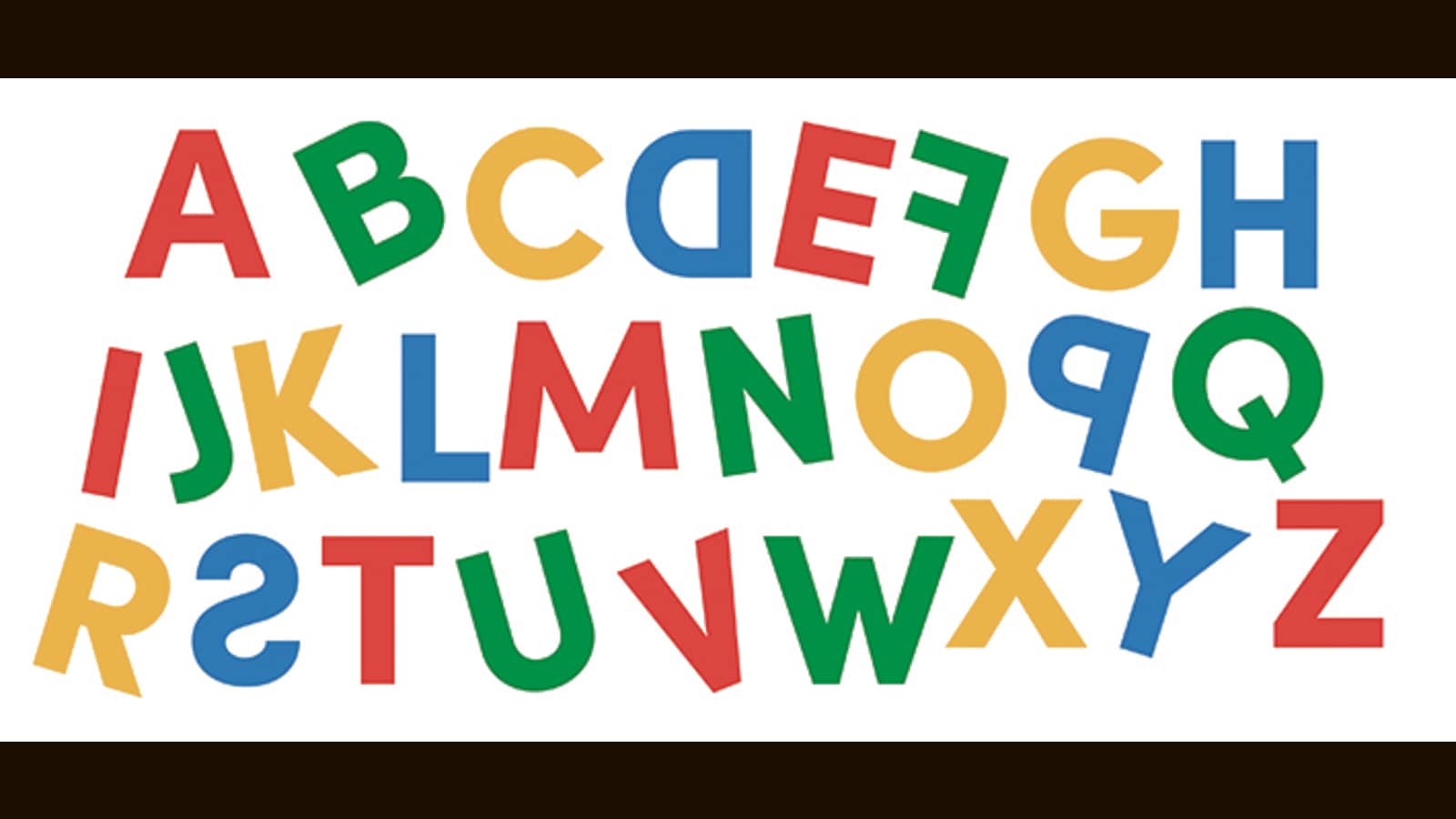
In her art work, colour was used as a differentiator, as well as positioning. So while “A” is always red and standing still, “B” is green and slanted to the left; “D” is backwards and blue, and so on.
Bhardwaj, a creative director, came upon the art work and was intrigued by how accurately it represented the world of dyslexics, and how engaging it was to someone like him, who is not dyslexic. He reached out to Egio to ask if she’d be interested in collaborating. “I wanted to make the letters live beyond a post,” he says.
The font they’ve created together uses the same geometric shapes, bright colours, and distinct patterns. It is available free and has had more than 600 downloads so far, via Egio’s website (rocioegio.com).
The initiative is a good one and could go some way towards helping, says Mrudula Govindaraju, a special educator with the Madras Dyslexia Association. “As a rule, sans-serif fonts tend to make the letters of the English alphabet easier to read and distinguish from similar letters, especially the ascenders in l, k, h and the descenders in g, y, p,”. The various fonts created for dyslexics tend to be thick and their ‘heaviness’ has helped certain readers distinguish between individual letters, thereby reducing errors in reading. My daughter uses Dyslexie for her school notes. Individual readers should find out for themselves what fonts work for them.”
Dyslexia management is multidisciplinary and multimodal, with many interventions that can help, adds Dr Aditya Gupta, senior resident of paediatrics at Delhi’s All India Institute of Medical Sciences. “Fonts are just one part of an entire equation. They can help. And for someone with dyslexia even a little help can go a long way.”
Enjoy unlimited digital access with HT Premium
Subscribe Now to continue reading
Stay connected with us on social media platform for instant update click here to join our Twitter, & Facebook
We are now on Telegram. Click here to join our channel (@TechiUpdate) and stay updated with the latest Technology headlines.
For all the latest Art-Culture News Click Here

