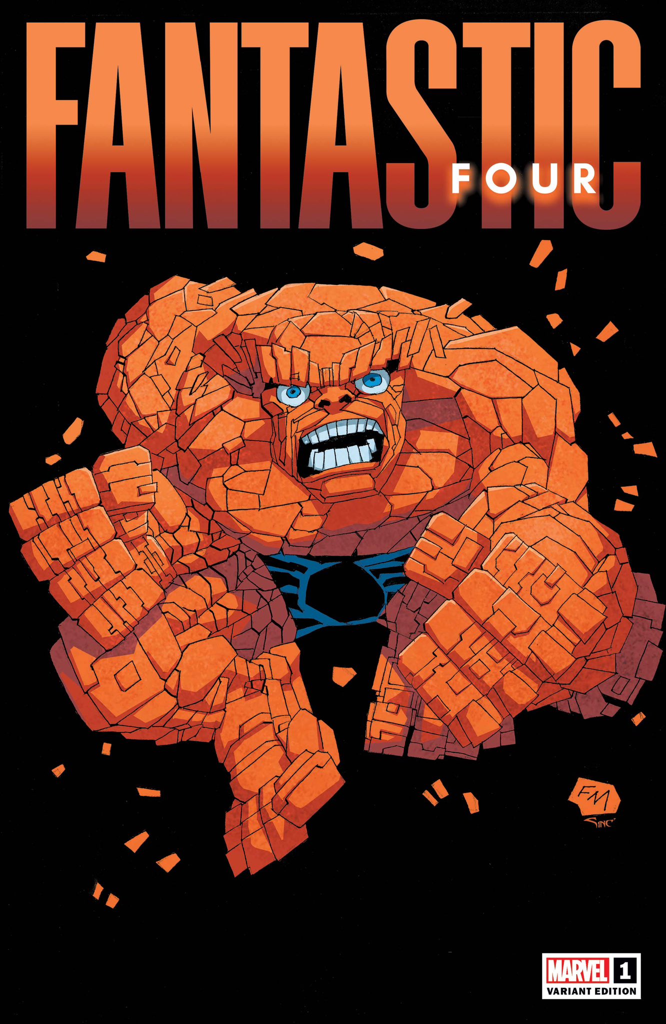
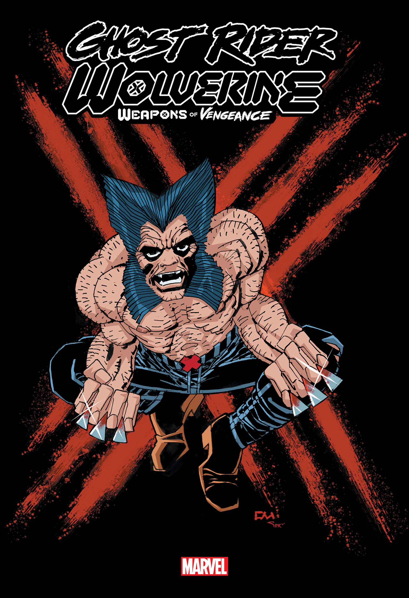
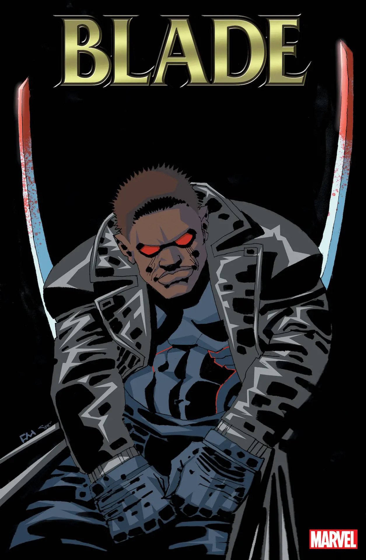
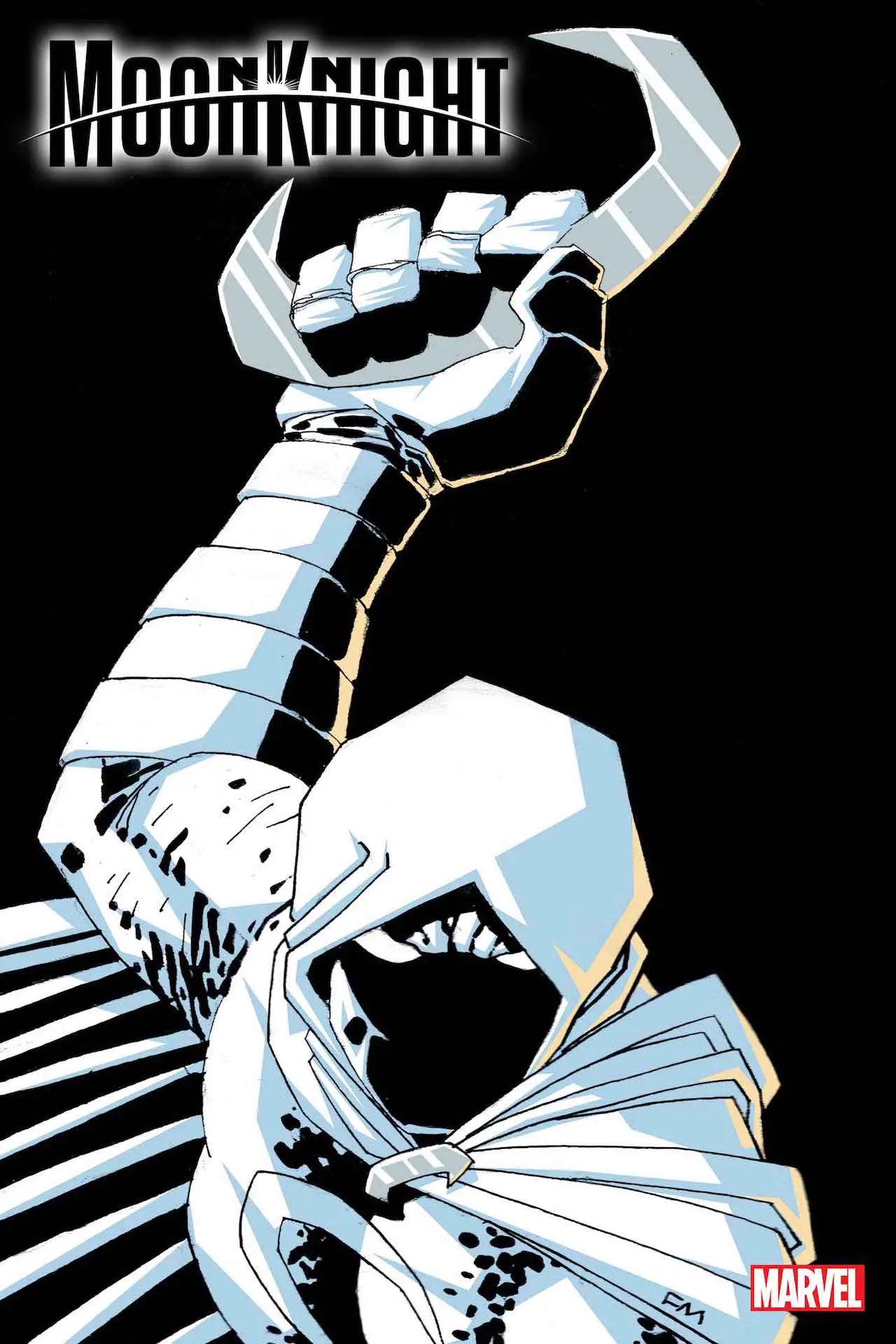
While there’s no denying the enormous impact legendary comics creator Frank Miller has had on the industry, he still remains as polarizing a figure as when he first broke onto the scene. Whether it’s his admittedly tone deaf content or a lawsuit by a former employee, Miller is no stranger to courting controversy. Over the weekend, a Frank Miller Wolverine variant cover became the the latest comics related hot topic on Twitter with many debating the artistic merit of the piece and the decline of Miller’s abilities as an artist.
The horrific Wolverine cover on the left is by the same artist that did the legendary cover on the right.
Marvel, if Frank Miller can’t see it, please help him see it. Don’t let him tarnish his legacy. pic.twitter.com/DFDXASDhpy
— ????????ℕ ???????????????????????????????? (@NorthernBrogre) May 13, 2023
This isn’t the first time a Miller variant cover has come under fire. Back in 2015, the variant Miller drew for Dark Knight III: The Master Race #4 was castigated by many in the Twittersphere that had everyone talking about its minimalist and/or shockingly incompetent art style. The DKIII cover evolved into a larger discussion of Miller’s obvious artistic decline with Ng Suat Tong going so far as to call Miller the Donald Trump of comics.
The cover was not without its defenders. CBR’s Brian Cronin pointed out that the uproar was an extension of many comics fans’ inflexiblepreference for hyperrealistic art, even though other styles are valid:
[The 1980s Wolverine cover] is a great piece of comic book art, but it’s a great piece of comic book art because it is well-designed, not because of any inherent superiority in detailed realism as a comic book art style. Miller’s current art is clearly about breaking things down to their simplest form, to achieve power from simplicity.
As a result, though, people often misunderstand stylized pieces like this as being like a lack of effort, when that isn’t the case at all. We see this, too, with some of the modern reactions to John Romita Jr. on his current Amazing Spider-Man run. The latest issue has a scene with Peter Parker and Mary Jane Watson talking and Romita Jr’s designs of the characters expression have been criticized on social media as Romita Jr. not putting in enough effort into the faces…
There were even positive tweets that praised the cover as “outsider art”:
It isn’t “good”, not in the way Immonen (faithful), Hitch (faithful) or Quitely (pleasing) are good. It’s ugly and scrawly, and distinctly off model. But it’s also unique and personal, as outsider art should be. The more I think about that cover, the more I think it fucking rocks
— what (@danmcdaid) May 14, 2023
This Frank Miller Wolverine piece is just the latest of either recent or upcoming variant covers. You can see how it compares to others below:

Reiterating again, Miller is one of the most imitated, influential and powerful cartoonists of the modern era. However, we’d be lying if we said his current work has achieved the same level of praise as his earlier work. Don’t think this is the last we’ve heard from Miller. With the establishment of his own Frank Miller Presents independent publishing imprint, Miller is returning to the world of his acclaimed noir series Sin City with a Western tale set in the city’s past, titled Sin City 1858. Likewise, Ronin Book Two is a follow-up to the six-issue miniseries from the ’80s.
Related
Stay connected with us on social media platform for instant update click here to join our Twitter, & Facebook
We are now on Telegram. Click here to join our channel (@TechiUpdate) and stay updated with the latest Technology headlines.
For all the latest Comics News Click Here


