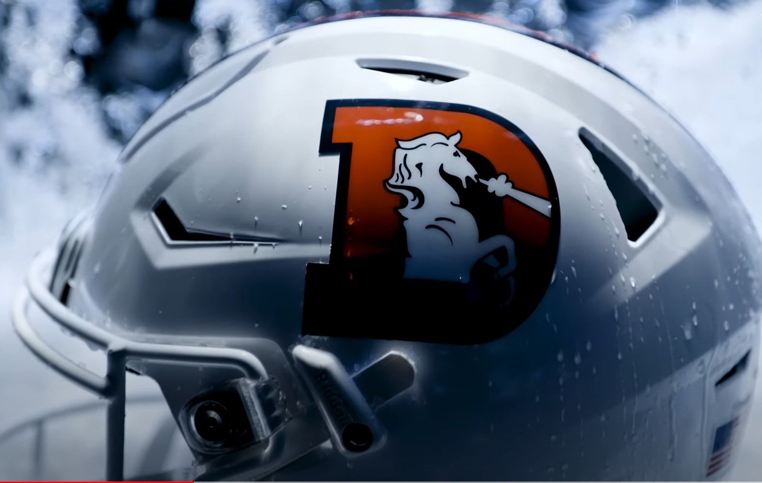
The new helmets are pretty. The helmets are cool. They’re…pretty cool?
But also meaningless, unless Denver actually starts winning some football games.
Pick your metaphor here: rearranging deck chairs on the Titanic, debating meat seasoning with Alfred Packer, Elon Musk dropping the Twitter bird and replacing it with an “X.”
In the Broncos’ case: offering Sean Payton’s squad a shiny new toy to play with after going 5-12 the year before.
Welcome to the family, snowcap. Let’s see how you stack up to Denver’s other lids over the years.
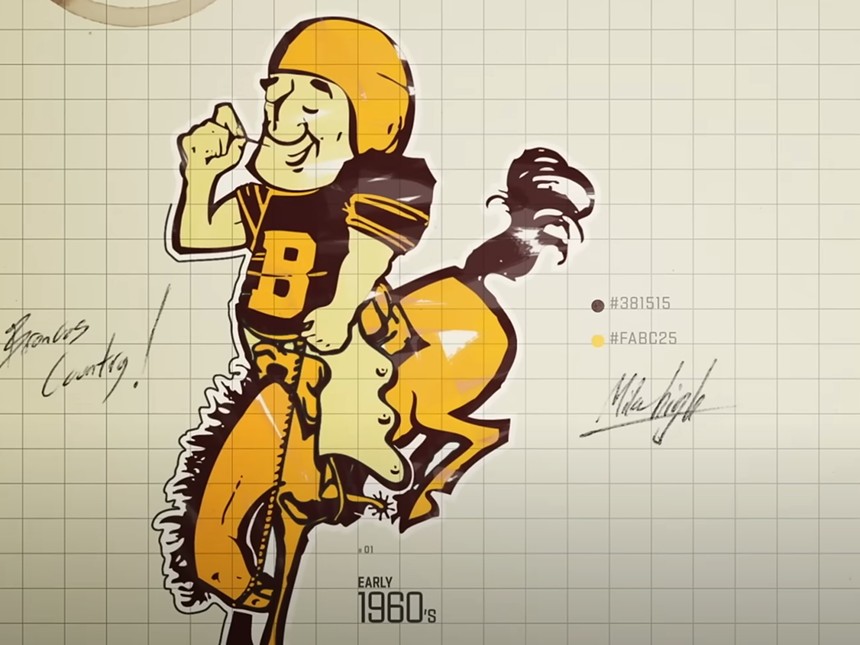
1960-61: The False Start
The Broncos’ first color scheme was something that was more reminiscent of a dirty diaper than fierce gridiron play. The jersey was mustard, the helmet a milky brown with a white stripe. The player’s number was in white on the right side. The whole thing was a terrible idea born from a lack of funding. The Broncos inherited the hideous threads after they were bought from a defunct bowl game out of Tucson, Arizona (where the colors might have actually made some sort of sense, even if they were terrible). The helmets were arguably the least offensive part — but that didn’t make them any good. The uniforms were so hated at the time and had become such a symbol of the Broncos’ early inability to win games that they were ceremonially torched by the team’s new coaching staff in 1962. Literally set on fire.
The very underrated Lionel Taylor was probably excited about not having to wear those striped socks anymore.
1962-67: That Horse Is Drunk
When Jack Faulkner was handed the reins in 1962, the Broncos’ colors and uniforms were the first thing he tackled. For a time, it’s said, the team considered a green color scheme, but word eventually came about that the newly formed New York Jets would carry that color, so Faulkner decided on orange with blue trim. The initial logo on the orange helmets was stenciled in blue, which turned out to be virtually impossible to make out on black-and-white TVs at the time. So the insignias on the helmets were changed to white for greater contrast. The starry-eyed horse who looked like he’d had one too many belts on Larimer Street? He lasted for five years before being put out to pasture.
1967-1997: Thirty-Some Years of Snorting
Lou Saban took over the GM/head coach role for the Broncos in 1967, and hated the caricature horse. It didn’t carry the sense of power he wanted to communicate to both opponents and fans. So in 1967, the orange helmets became blank — nothing at all was on them. That season brought the “snorting horse” design, which would come to emblazon the helmets starting in the 1968 season and continue for nearly three decades.
1994: The Throwback Year
The NFL was commemorating its 75th anniversary in 1994, and teams throughout the league were invited to design some “throwback” uniforms to honor the occasion. Instead of going back to the mustard-and-brown design with the mousy brown helmet, the Broncos updated the squad’s 1962 look for their selected anniversary game, while keeping it a more modern shade of orange. The alteration didn’t do much to help the Broncos’ chances at winning, though, with the Raiders walloping Denver at home, 48-16. The team may have been taking the throwback spirit a little too seriously.
1997-2023: No More Funny Business
Design got serious in the Broncos camp during its 1997 rebranding — offering up a completely new concept that hasn’t changed much since and will continue for now, even with the announcement of the team’s new “snowcap” alternates. Owner Pat Bowlen consulted with Nike to bring about the new logo that would make the team “No. 1 in everything,” as he put it in an interview with the Colorado Springs Gazette-Telegraph. The helmet design was especially striking: a sleek windswept look of the new equine logo, a big change from the orange primary color scheme to dark blue (which only lasted for a few years, reverting back to orange completely in 2012). But it ultimately did its job. Not only were fans excited about the makeover, but so were players — with defensive end Neil Smith famously admitting that he never liked the old design. “It looked like [the horse on the old logo] was sneezing,” he told now-defunct Broncos radio station Orange and Blue 760 in a 2017 interview. The new logo made him feel like the team was on the right track when he joined the team after nine seasons in Kansas City. Safety Steve Atwater agreed, telling the Gazette-Telegraph that “Navy blue looks meaner than orange.”
2023: The Mountains Win Again
So now we have this new design — not replacing anything, but adding to the alternate options for the team. Aside from the white, the helmet is a throwback of its own, too, with the snorting horse nestled inside of the classic “D” logo and the orange-and-blue colorway still right there in the stripe. Will this new design be a harbinger of better things to come for the beleaguered hometown favorite? Or will it just be our own White Whale?
Only time — and our team — will tell.
Stay connected with us on social media platform for instant update click here to join our Twitter, & Facebook
We are now on Telegram. Click here to join our channel (@TechiUpdate) and stay updated with the latest Technology headlines.
For all the latest For Top Stories News Click Here


