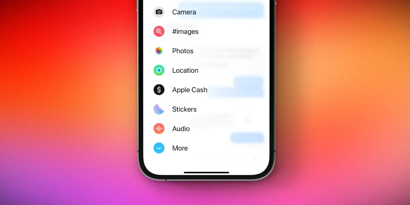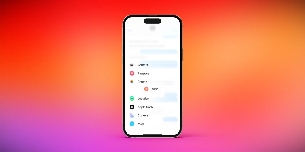
One of the more noticeable design changes in iOS 17 this year is in the Messages app. Apple has revamped the interface and moved access to iMessage apps and shortcuts to a new pop-up menu. Here’s a closer look at these changes, with a trick to get one-tap access to the Photos picker.
This story is supported by Mosyle, the only Apple Unified Platform. Mosyle is the only solution that fully integrates five different applications on a single Apple-only platform, allowing businesses and schools to easily and automatically deploy, manage, and protect all their Apple devices. Over 38,000 organizations leverage Mosyle solutions to automate the deployment, management, and security of millions of Apple devices daily. Request a FREE account today and discover how you can put your Apple fleet on auto-pilot at a price point that is hard to believe.

How to customize the new iMessage apps interface
This change to Messages was controversial in the early betas of iOS 17, and Apple made a few changes to the interface throughout the beta testing process. Still, despite the beta tweaks, people are proving to be perplexed by these interface changes now that iOS 17 is available to everyone.
In iOS 17, there’s a new “+” plus button next to the text field. Tapping this reveals a full-screen pop-up menu that gives you access to iMessage apps, as well as access to the Photos app picker to send images. The interface shows a handful of quick access icons by default, with a “More” option with every iMessage app you have installed.

My first tip for adjusting to this new interface in iOS 17 is to reorganize the order in which these apps appear. Here’s how to do this:
- Tap the “+” icon to reveal the list of Messages app
- Long-press on an app, and you can drag it up or down in the list of options
This also works for apps in the “More” section of the interface, so you can move apps to and from the hidden “More” list with ease.
The hidden trick for accessing the Photos picker
But one of the most common complaints I’ve seen about the new Messages interface in iOS 17 is that it takes a little extra work to access the Photos app picker. This is the most-used iMessage app for the vast majority of people.
Did you know there’s a hidden trick for accessing the Photos picker with a single tap? Just long-press on the “+” icon, and the Photos interface will automatically appear. No need to access the new full-screen interface whatsoever.
What do you think of the revamped interface for iMessage apps in iOS 17? Have you adjusted to the changes, or do you prefer the old design? Let us know in the comments.
Stay connected with us on social media platform for instant update click here to join our Twitter, & Facebook
We are now on Telegram. Click here to join our channel (@TechiUpdate) and stay updated with the latest Technology headlines.
For all the latest For Top Stories News Click Here

